Posts

Showing posts with the label Island Indigo

Butterfly Basics

Image
Hello all, Back at last and hoping to get into the flow of things again.  I can't believe I've missed a month!  It's not as though I haven't been crafting, I might have to back date a few things. But here's a card I whipped up in a few minutes (seriously!) Everywhere you look on Pinterest at the moment, there are cards using this set.  In the end I succumbed myself and bought it and it's proved to be one of the lovliest sets I've ever bought.  This is what I made at the weekend for a friend's birthday: As you know, I love to case, and use what I have in my stash to replicate a card I like.  The colours I used are: Island Indigo for the base, then a layer of Pool Party.  I stamped a couple of times with the water blot type stamp from the French Foliage stamp set and used the New York post stamp under the butterfly's wings (which you can't see very well, but it is there!)  Then I die cut the medium sized butterfly from the set and popped it o...
Hexagon Fun

Image
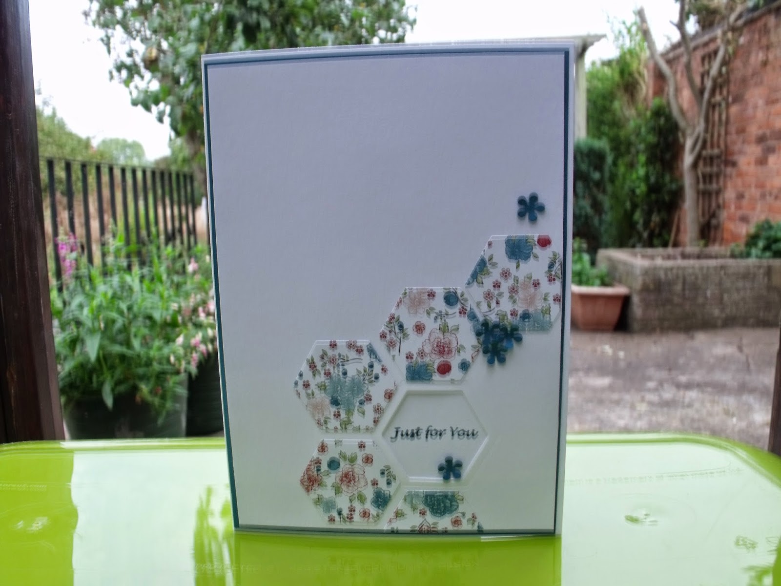
Hi guys! I've been very, very busy on the Project Life front and have joined two brilliant groups on facebook, but I have made some changes too.  As soon as I've got some piccies ready, I'll update you on my progress. In the meantime, I've been extremely busy on the card-making front as well.  I work in a care home and I make a card for each resident on their birthdays for all the staff to sign.  I had no idea there were so many in November and December.  This is partly why I haven't been on here so regularly, I've actually been making the cards and thoroughly enjoying this amazing hobby. As well as that I run a card swap group.  There are ten members and we make a card for one other person in the group each month.  This is the card I made for Aileen Skene's birthday in October: I saw something similar on Pinterest (if I ever find it again I promise I'll credit it) using a different dsp of course.  I am actually winning the battle to get through...

Card For Joan

Image
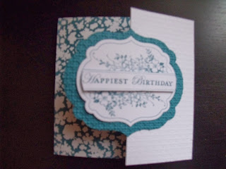
Such a simple card, made for one of the residents last week.  I'm not sure if the photo is clear enough, but the section on the right hand side has been put through the square lattice embossing folder.  Island Indigo is probably one of my all-time favourite colours and I love the dsp used here from Twitterpated.  It wasn't a massive card and had loads of signatures on it from all the staff, which the recipient was thrilled with.  I enjoyed making this so much I might pop off and make a couple more! Back soon Jane xx

Cards For Men

Image
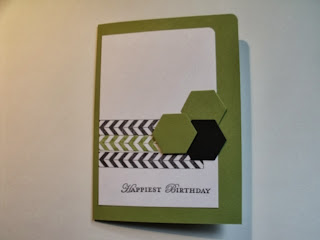
Hello all! Sorry I haven't been here for a while, things have been so busy.  I've hardly had time for crafting, let alone blogging as well. But when I have had time, I've been really enjoying myself.  Take the top card.  Sorry I can't remember where the inspiration came from, but I had great fun making this.  The green is Lucky Limeade.  I still love this colour, especially with black. This was the next one, with a different colour combination: I sent this one to my son in law.  I like the texture on these hexagons, but there is something lovely about the smooth ones on the first card, too.  You'll probably know the stamp set is Tape It from SU.  This is such a versatile set I'm using it on everything.  The blues are Tempting Turquoise, Island Indigo and Midnight Muse, which match the striped stamp sections. The next step was to make this one: This was for my son's birthday at the end of August.  It's literally 3 strips of ...

Butterflies Forever

Image
I seem to be making sets of cards lately.  You know me, once I get an idea in my head I love to play around with it.  Have a look at these: I was, of course, inspired by a card on Pinterest, this time by Erin Gonzales.  You can see her card here .  I really liked her card, but I wanted make one without the whole of the white panel being embossed so I could put a sentiment on it that could be read easily.  I loved the combination of backing paper, the little banner at the top, and of course, the butterflies.  The yellow panel at the back is Summer Starfruit, the pink is Primrose Petals and the blue is Island Indigo.  I used some of the images in Summer Silhouettes to stamp in white on the background panel. Note: It is entirely because of this card that I have bought the dsp for the In-Colours shown here.  So much for using up all my dsp! The next step was to find some stripy dsp, as I really liked this look in Erin's card....

Card For Lorayne

Image
Do you ever go on a bit of a journey with your cardmaking, where one thing leads naturally to another?  I know once I get an idea in my head (and it works!) I like to see where else I can go with it.  Let me explain. This card came to me in my sleep. My starting point was the dsp from Twitterpated, in the Island Indigo colour, so I sat for a while trying to decide what colours would go well with it, and it had to be this set again, ie Pool Party, Tangerine Tango and Rich Razzleberry.  I started by stamping the little flower arrangement in the top right corner, loving the fact that the leaves are in Island Indigo and not a green (because you get blue leaves, right?!)  Then I ran the card through the Bigshot with the honeycomb ef.  I was fascinated by the effect, and after that the rest of the card was a doddle.  The flower has been cut with my Sizzix flower die set, which comes with co-ordinating stamps and it rather cool!  ...

Cards For Men - It Must Be Lurve!

Image
Hello everyone!  It's still a bit nippy, isn't it?  We've had snow all day.  I've been on a course in Nottingham and was worried about getting home, but we've made it. The good thing was, we had a late start so I had a chance to photograph the Valentine card I've made for John while he was out of the house! The other blog challenge I want to keep up with this year is the Cards For Men challenge .  This is challenge no. 3 and they want to see Valentine, Anniversary cards etc, so here is my entry: So many cards on the internet are pink, aren't they?  But as most cards are made by women to give to the important man in their lives, I just wondered if there ought to be more of a focus on masculine cards.  I've seen a few cards like this though, and love this kind of design and just had to have a go. The base is kraft card, followed by very vanilla, which I distressed with Tim Holtz old paper ink and went round the edges with some soft suede ink, befor...

Thankyou

Image
Obviously it's dawned on me over a period of time that when you see a group of SU! colours on a set of dsp, it's their way of saying, "Hello!  These colours work together well, guys!" (for people who are a bit thick, like me!) So I keep noticing cards using the new dsp Sycamore Street (part of sale-a-bration, by the sound of it) and am fascinated by the colour scheme of Island Indigo, Pool Party, Rich Razzleberry, Sahara Sand, Summer Starfruit and Tangerine Tango.  These are colours it would just never occur to me to put together, but I find them so striking, I just had to have a play.  This is what I made: So you can see, the base of this 4"x4" card is Island Indigo, with a slightly smaller square of Rich Razzleberry (a colour I've hardly touched) that has been run through the square lattice embossing folder, followed by a stamp from Four Frames in Tangerine Tango.  I have never used this colour before, even though I've had it a year.  I cut...